
PROJECT OBJECTIVE
Create a mobile app for scanning mail containers to trailer position. Create an online Load Manifest that captures container information and position. Communicate data to other applications. Design for accuracy, error prevention and efficiency.
DESIGN CHALLENGE
Transform a robust, information-heavy, largely manual process into an intuitive digital user experience.
Turn broad conceptual ideas into elegant solutions centered around the users’ success at completing their jobs and connecting to the organizational strategy.
Timeframe
2023 - 2024
Client
Mail Innovations, UPS
Role
Sr. UX/ UI Designer
CONTEXT
The Trailerization App was part of a suite of five applications I designed for UPS, Mail Innovations Department as part of a significant modernization initiative. Operational processes, technologies, and applications were revamped to make mail processing more efficient, faster, and accurate.
MY CONTRIBUTION

Drove UX Research and Design
Planned and facilitated discovery sessions with stakeholders to understand the business operations and goals, the vision for the trailerization process, the users’ context and needs.

Defined Focus and Direction
Synthesized research into design problems and requirements which guided the app's conceptualization, design, and testing.

Design for accuracy, error prevention and efficiency
Defined design principles that connected the users’ jobs-to-be-done to the organizational strategy.
Applied visual communication principles to make the interface and navigation simple and intuitive.
Iterated on the user flows and screen design to achieve simplicity and efficiency.
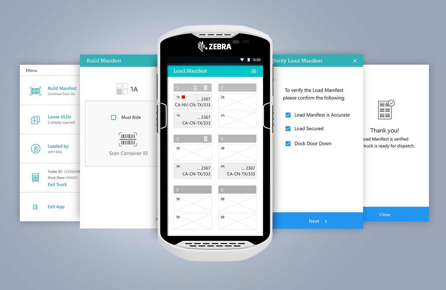
Screenshots form the Trailerization App
Skills
UX Research
Research Synthesis
Big Picture Thinking
Problem Definition and Design Principles
Personas
User Flows
Information Architecture
Mental Models
UI Design
Visual Communication
Icon and Logo Design
CASE STUDY
Design for Accuracy and Efficiency
The following case study showcases the conceptualization and design of the Trailerization App for scanning containers to trailer position and creating an online Load Manifest. Accuracy and efficiency were achieved through:
Minimizing the user input to eliminate human errors and increase efficiency
Streamlining and simplifying the user flows
Designing a simple and intuitive user interface to guide the user and reduce cognitive load.
UX Research
I led regular discovery and review sessions with various stakeholders - Operations and Transportation Managers, an Industrial Engineer, a Product Owner, a Scrum Master, and a team of developers.
The sessions focused on understanding the operational processes, the business goals and vision for the app, and the users’ context, needs and goals.
Understanding the Business Processes
For the team to think holistically and understand the role of the trailerization process and app, I created a high-level visualization of processing and transferring mail between UPS facilities (click image to enlarge).

Defining the Business Goals for the App and the Suite as a Whole
In addition to understanding the operational processes, I led discussions to define the desired business outcomes to bring context, focus and alignment to the team (click to enlarge).

Personas - Understanding the Users’ Needs and Context
I documented the user's goals, pain points, and opportunities for improving their experience.

Jobs-to-be-Done - Define Specific User Jobs
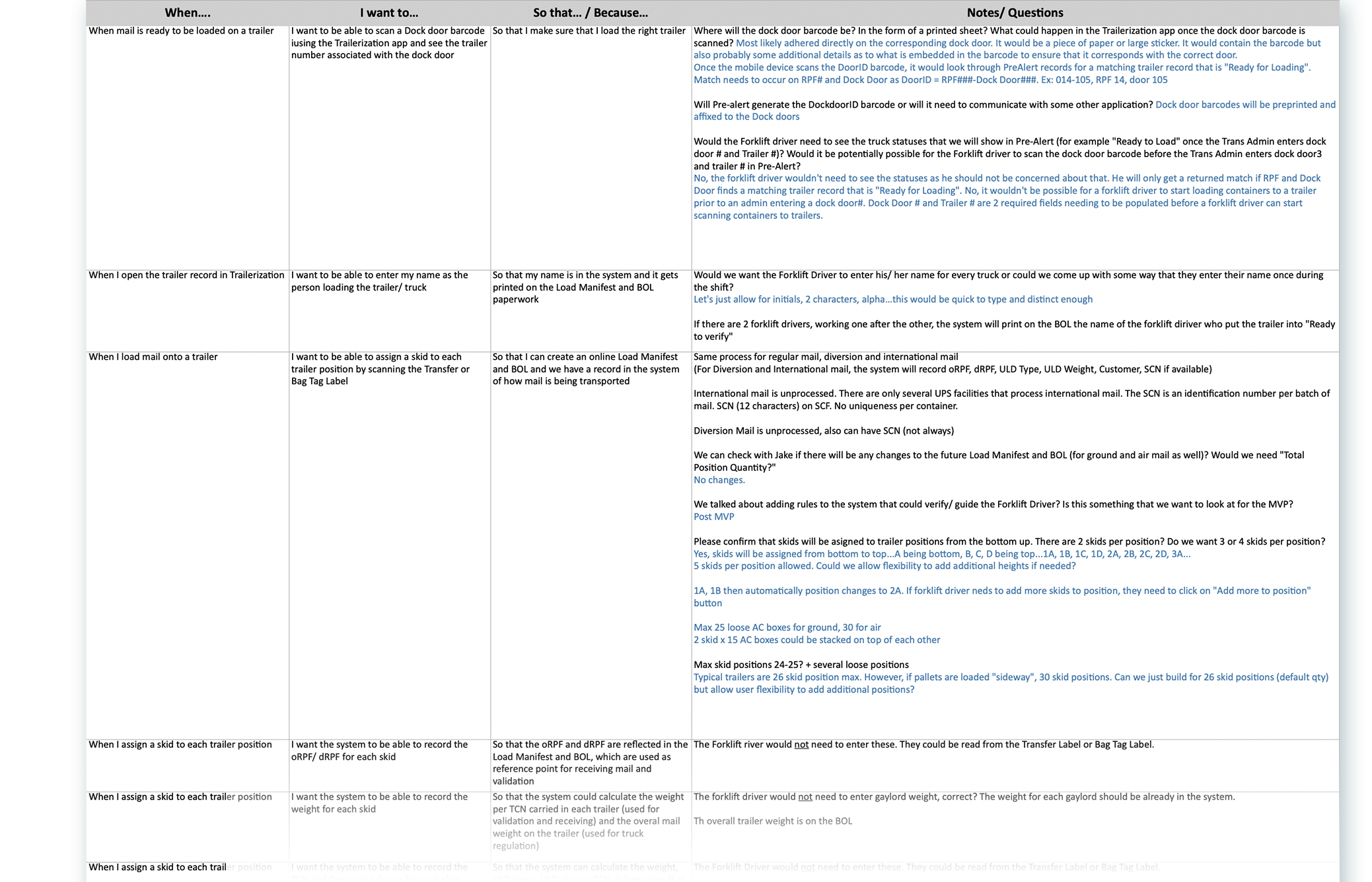
I used the Jobs-to-be-Done framework to capture as many of a persona's goals and tasks. I was particularly interested in the “Why” behind each job. “So that…” and the “Notes” sections in the document helped us identify deeper user needs or additional complexities associated with the business processes.
Defining Design Principles
The following themes from the research were used to draft our Problem Statement and Design Principles:
Pain Points
Creating the Load Manifest was:
manual and prone to errors
time consuming
User Goals
Create Load Manifest correctly
Identify and correct errors in a timely manner
Business Goals
Move mail in the network
Quickly
Accurately
Problem Statement
How might we ...
Design a digital experience for Forklift Drivers to quickly and effortlessly create an accurate, easy-to-review, and easy-to-update Load Manifest.
Design Principles
Require minimal input from the user
Guide the user
Use familiar mental models
Make the process quick and simple
Design an intuitive interface
Build validations, prevent errors
Concept & Prototype Development
Design for Efficiency
From information Architecture to User Flows
Jobs-to-be-done helped me record the needs as requirements. Then I identified the user goals and steps needed to achieve the goals.
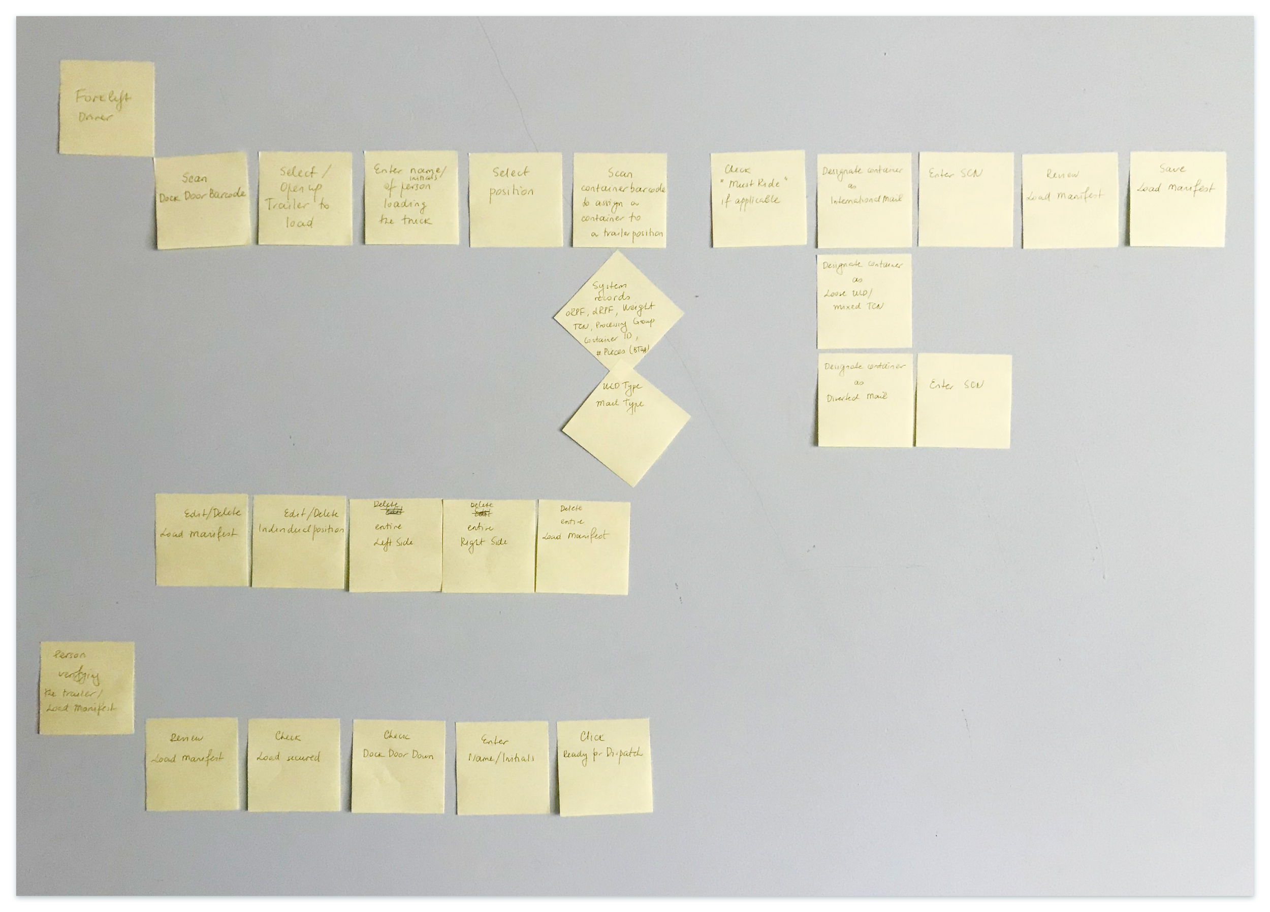
Jobs-to-be-Done affinitization to define the main app functionalities
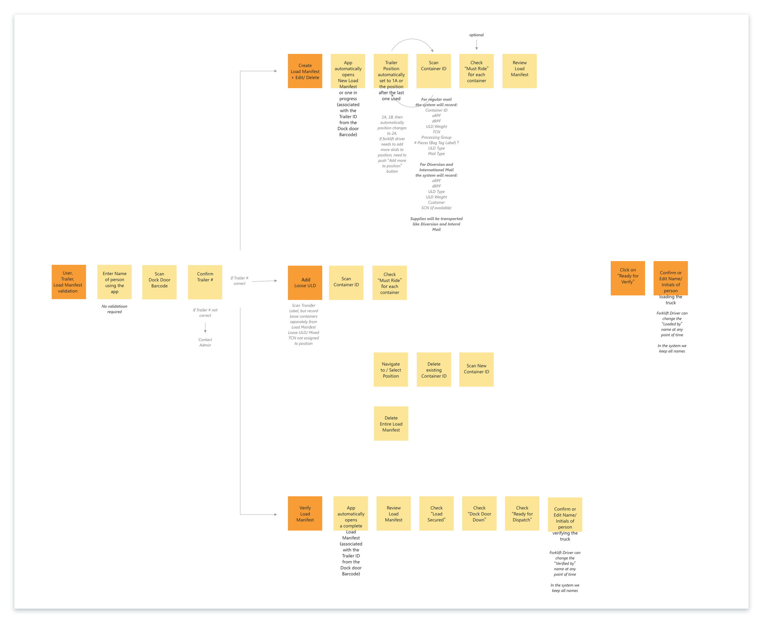
Jobs-to-be-Done Map - working towards information architecture
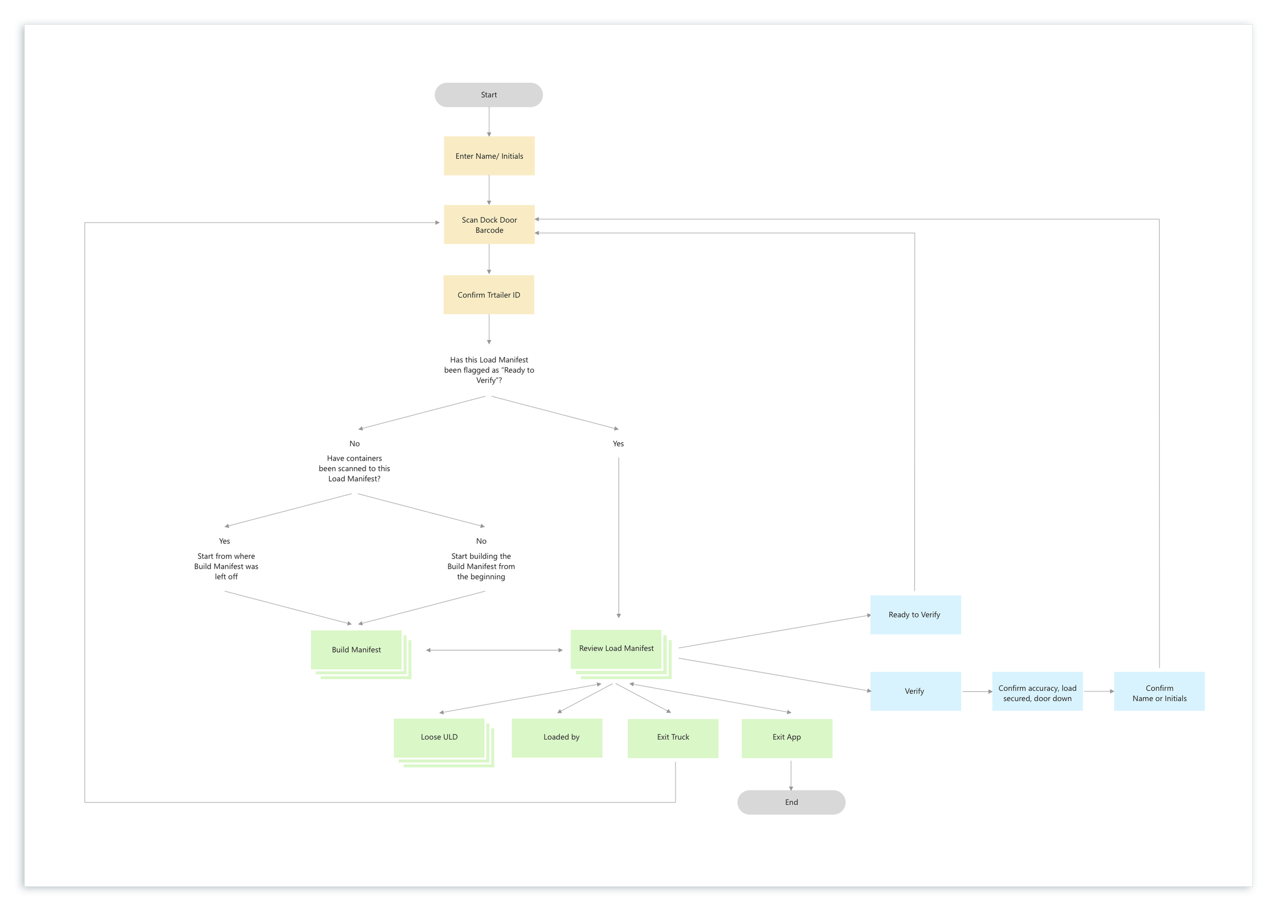
User Flows
Using familiar mental models
I used the actual process of loading containers as a mental model for Forklift Drivers to create the online Load Manifest.
Just as a forklift driver in a warehouse would physically remove all containers from a position and re-stack them, I designed the app to provide a similar functionality. Users could easily delete all containers from a position and rescan them back, mimicking the real-life process.
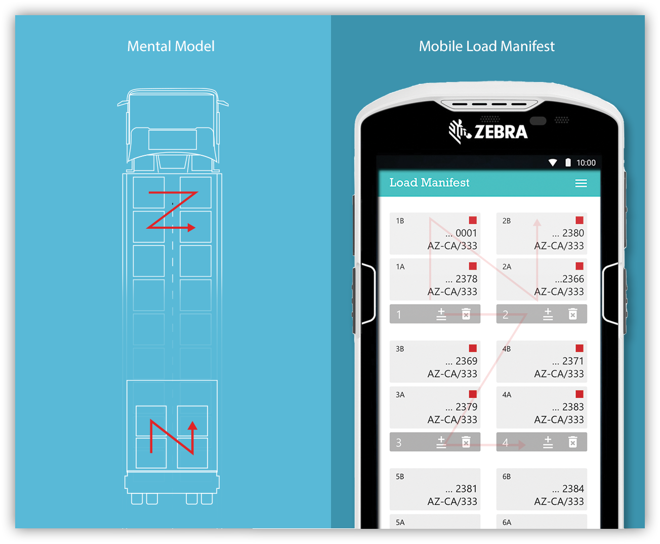
Bringing focus and visual hierarchy
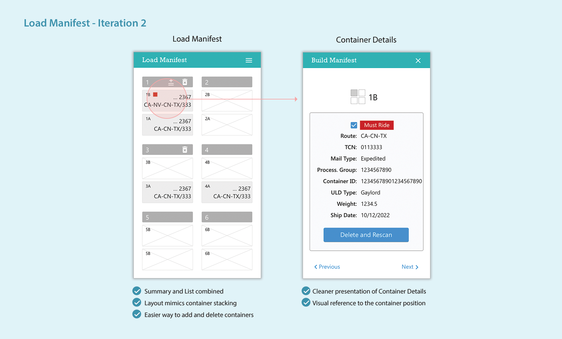
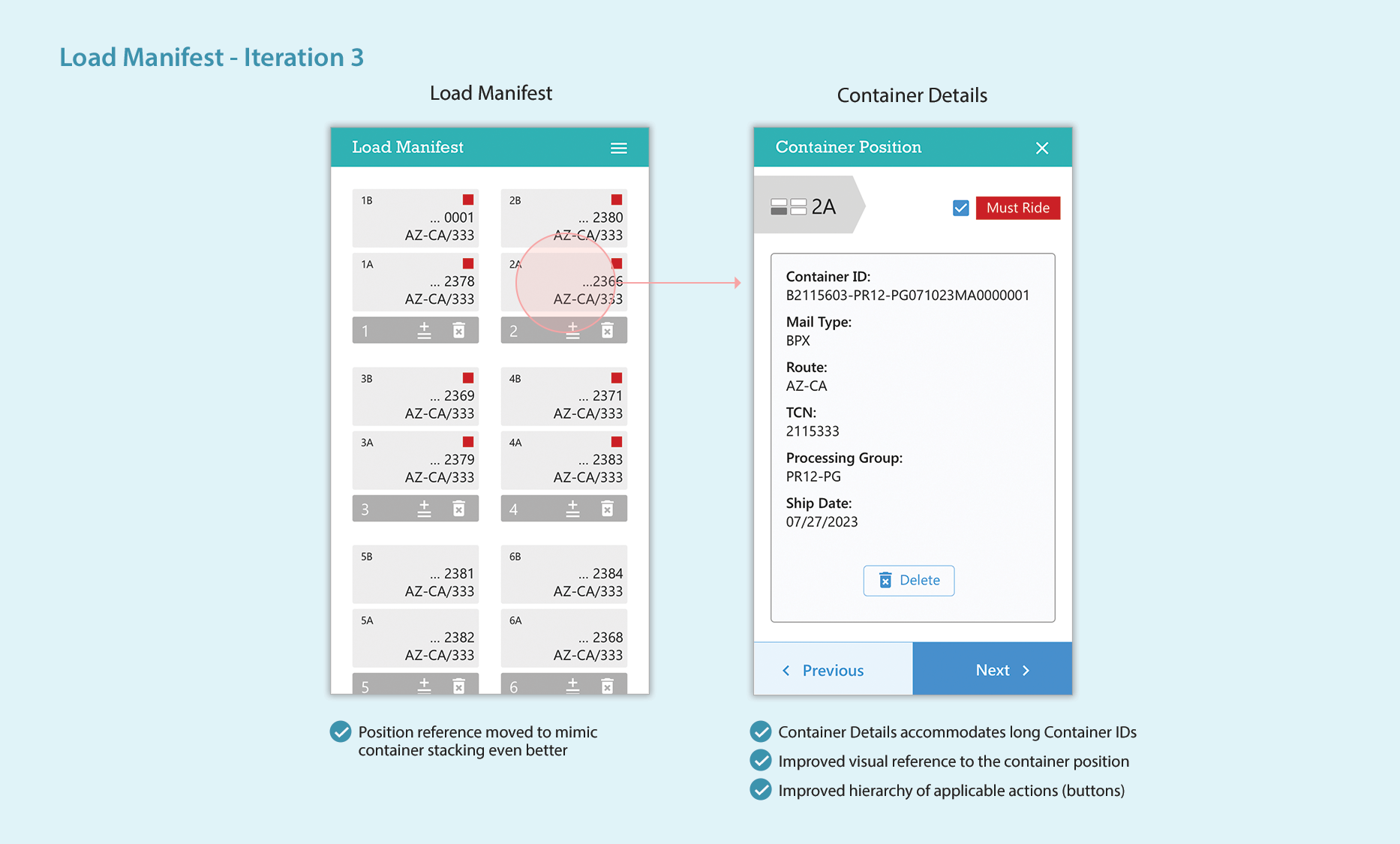
What initially looked like a challenge presented an opportunity to introduce focus and hierarchy—only four “containers” could be seen at a time, each with a summary of the most important information. Clicking on a “container” opened up additional details for verification or inquiry.
The Load Manifest acts as a central and pivotal point. A hamburger menu takes the user to the rest of the app.
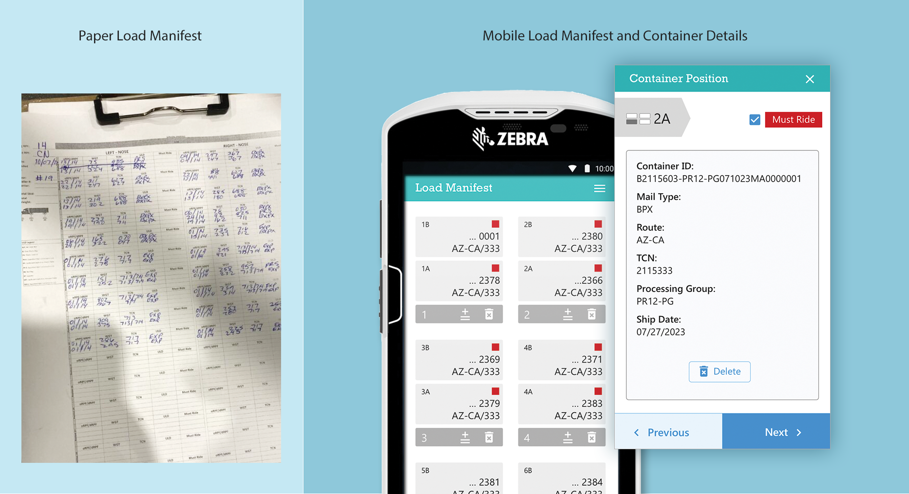
Further iteration and refinement
I explored multiple ideas for the Load Manifest to achieve simplicity, ease of use, and minimal user input. The illustrations below show a progression of the design of the online Load Manifest and Container Details screens.
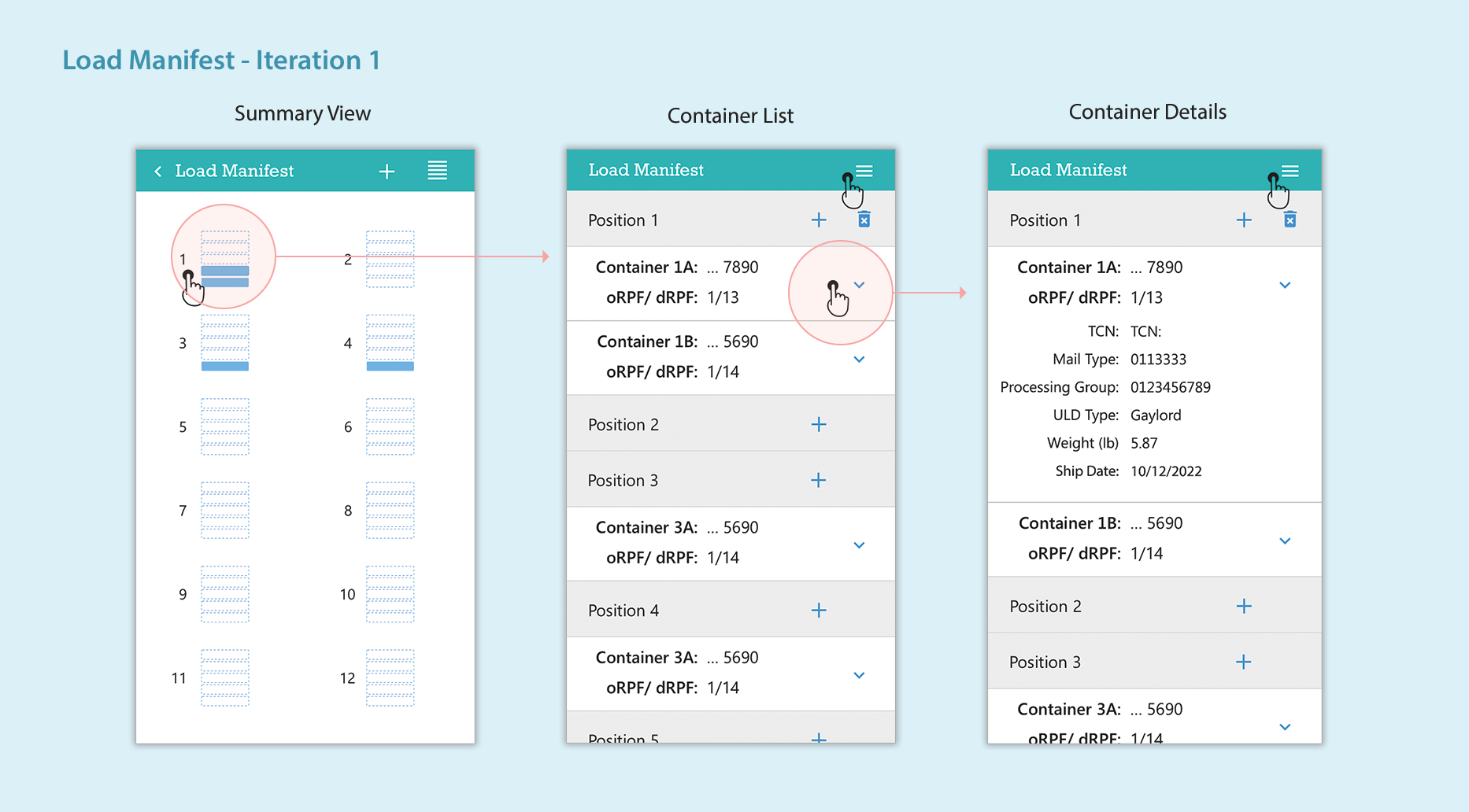
Simplifying the navigation and flows
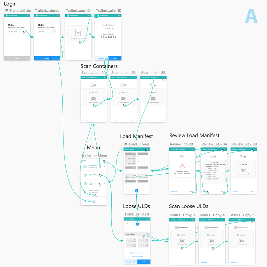
I experimented with different ideas for the user flows and navigation. I created clickable prototypes and tested them with the Industrial Engineer and the Product Owner. The prototypes are available for further testing with users.
A Home page serves as a landing page and main navigation tool. The Load Manifest is one of the options on the Home page.

Design for Accuracy
Scanning containers to trailer position
One of the main advantages of the new process was creating the Load Manifest by just scanning the container labels. No manual input would be necessary.
Guiding the user
I strived to make the user flows and screens as simple as possible to make scanning containers to a position easy, quick, and error-free. I provided options for the forklift drivers to deviate from the standard flows when necessary.

PROJECT OUTCOME
The prototypes were presented to a group of Operations Supervisors and Transportation Admins and received a favorable feedback and a green light for further development.
We have two clickable prototypes with several design explorations to be tested with real users.